The top of Home: the running game in its own art, and how reachable he is.
Concept · live ReactSource file: tokens.jsonReact component: NowPlaying
Try it
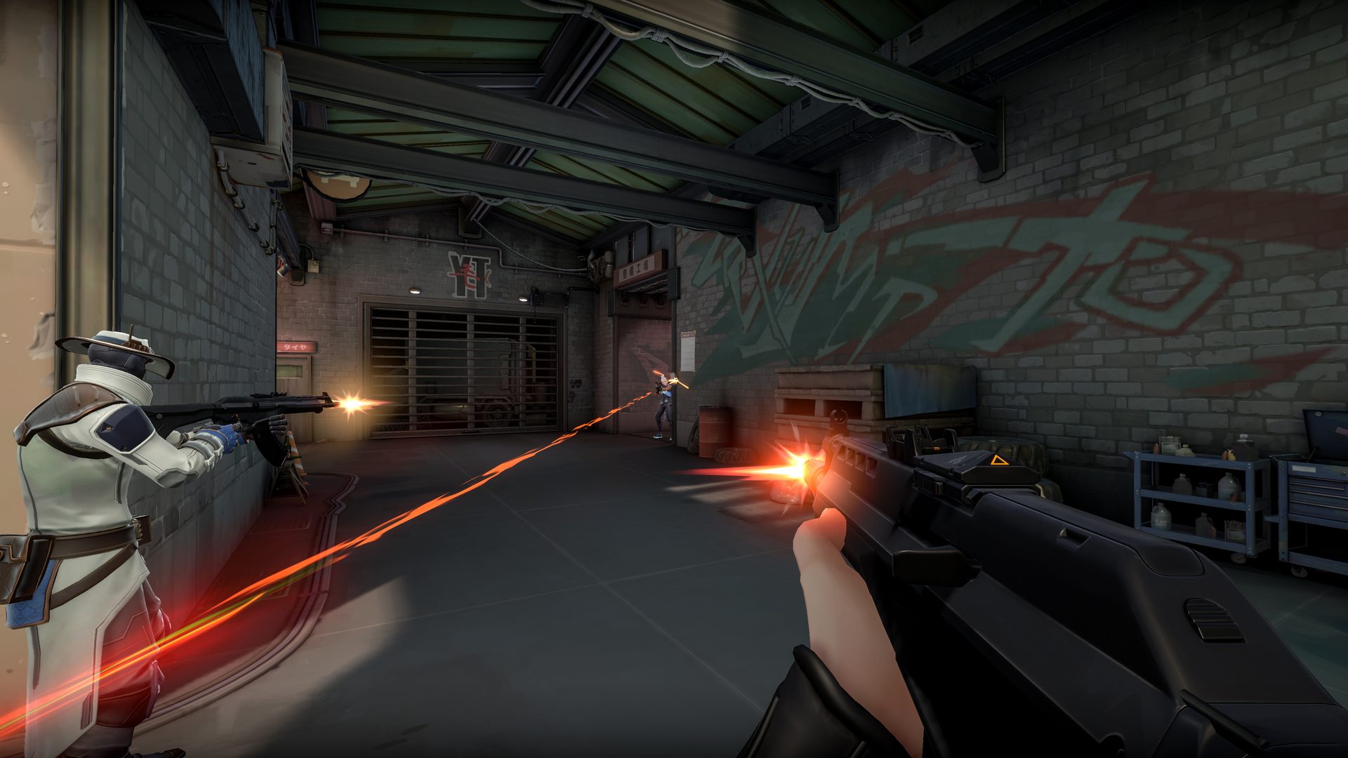
The real hero. Quit the game to see it fall back to its quiet, artless state.
Now playingIn a match, ranked
How reachable you areMessages wait for the buy phase or a death screen.
Now playingIn a match, ranked
How reachable you areMessages wait for the buy phase or a death screen.
When to use
Once, at the top of Home. It answers the two questions he opens the window with: what’s running, and who can reach me right now.
The game’s own art and lockup, where there’s official art for it.
Don’t use it
A second hero on any page.
Stats in the hero. The footprint is one quiet line further down.
Accessibility
A labelled region (“Now playing VALORANT”). The game art is decorative; the lockup has the game’s name as its text. The wash under the words keeps them above 4.5:1 on any frame of the art.
Key
What it does
Tab
Moves to the control.
← →
Moves between the reachability options.
Props
Prop
Type
Default
Description
(none)
—
—
Reads the running game and reachability from the dashboard store.
Reachability
One control for open, quiet moments or heads down, replacing three overlapping switches.
Concept · live ReactSource file: tokens.jsonReact component: Reachability
Try it
Pick one. The hint under it says what happens to a message right now.
How reachable you areMessages wait for the buy phase or a death screen.
How reachable you areMessages wait for the buy phase or a death screen.
When to use
Open: messages land the moment they’re sent.
Quiet moments: they wait for the buy phase or a death screen.
Heads down: only urgent gets through, for an hour, with a banner and End now.
Don’t use it
A separate heads-down button or quiet-moment switch anywhere else. One idea, one control.
Per-person muting here. That lives on the person.
Accessibility
A radio group labelled “How reachable you are”, one tab stop. The hint is plain text beside it, and the change is confirmed in a polite toast.
Key
What it does
Tab
Moves to the control.
← → ↑ ↓
Moves and selects.
Props
Prop
Type
Default
Description
onDark
boolean
false
Glass styling for the game art behind it.
Person card
Someone who can reach him: their rules as tags, their last message, and his reply.
Concept · live ReactSource file: tokens.jsonReact component: People
Try it
The real list. Reply to a missed message from the card; the menu edits rules, mutes or removes.
Your people
2 of 3 on Free ·
SarahPartner, since March
Any time
Can send urgent
Sees the score
Lonely6:43 pm
dinner’s ready, come eat with me
You replied “After this match”
MMumSince April
8am to 10pm
No urgent
Sees “gaming”
4:10 pm
call me tomorrow?
You replied “On my way”
Your people
2 of 3 on Free ·
SarahPartner, since March
Any time
Can send urgent
Sees the score
Lonely6:43 pm
dinner’s ready, come eat with me
You replied “After this match”
MMumSince April
8am to 10pm
No urgent
Sees “gaming”
4:10 pm
call me tomorrow?
You replied “On my way”
When to use
One card per person who can reach him, in the order they joined.
Their last message on the soft pink, because it’s theirs; his reply under it in ink.
A join request in the same place, with Approve and Decline.
Don’t use it
A search box or capacity bar for a handful of people.
Rules as a sentence. Three tags scan faster.
Accessibility
A list of list items. The avatar is decorative beside the name; the menu button is named “More for Sarah”. Every action is a real button at 40px or more.
Key
What it does
Tab
Moves to the control.
Enter / Space
Opens the menu or the action.
Props
Prop
Type
Default
Description
onEdit
(id: string) => void
—
Opens that person’s rules.
Tags and badges
Short labels for a rule or a state. Ink by default; pink only for someone at home.
Concept · live ReactSource file: tokens.jsonReact component: RuleTags, Badge
Try it
8am to 10pm
Can send urgent
Sees “gaming”
Muted
RuleTags
You: On my wayBadge
Runninglive
Invitedwarn
8am to 10pm
Can send urgent
Sees “gaming”
Muted
RuleTags
You: On my wayBadge
Runninglive
When to use
Tags for the parts of a rule, each with an icon so they don’t rely on colour.
Badges for a state: running, invited, his reply.
Don’t use it
The accent tone for anything of his. Pink means someone at home.
Accessibility
Tags are a labelled list (“Their rules”). Text is at least 4.5:1 on its fill in both themes; on dark the fill is a light veil so the shape still reads.
Key
What it does
—
Not interactive.
Props
Prop
Type
Default
Description
rule
Rule
—
RuleTags: hours, urgent, seesScore, muted.
tone
'neutral' | 'accent' | 'live' | 'warn'
'neutral'
Badge.
Game icon
The game’s own icon where there is official art, a neutral tile where there isn’t.
Concept · live ReactSource file: tokens.jsonReact component: GameIcon
Try it
Valorant
Counter-Strike 2
Overwatch 2
Fortnite
Valorant
Counter-Strike 2
Overwatch 2
Fortnite
When to use
Beside a game’s name: the games list, setup, the sidebar status, her People list.
The official icon only: Riot’s asset kit for VALORANT, each game’s Steam icon for Counter-Strike 2 and Overwatch 2.
Don’t use it
A copy from a logo aggregator. Without official art, the neutral tile.
Accessibility
Decorative: the game’s name is always next to it, so the image has empty alt text.
Key
What it does
—
Not interactive.
Props
Prop
Type
Default
Description
name
string
—
The game’s name.
size
number
32
Pixels; the corner radius scales with it.
Card
A titled container on the card elevation. No grey stroke; one level only.
Concept · live ReactSource file: tokens.jsonReact component: Card
Try it
Found on this PC
Card content.
Found on this PC
On dark, a faint edge replaces the shadow.
When to use
A major container with a title and, at most, one action.
Don’t use it
A grey stroke. Depth is the card elevation.
A card inside a card.
Accessibility
A section named by its title, which is an h2 under the page’s h1.
Key
What it does
—
Not interactive itself.
Props
Prop
Type
Default
Description
title
string
—
The h2.
action
ReactNode
—
One button or link at the right of the title.
Segmented control
Two to four mutually exclusive options, all visible, one tab stop.
Concept · live ReactSource file: tokens.jsonReact component: Segmented
Try it
When to use
Two to four options he can see at once and pick one of.
Don’t use it
Five or more. Use a select.
Actions. These are choices.
Accessibility
A radio group with one tab stop; the selected option is the white pill and is announced as checked.
Key
What it does
Tab
Moves to the control.
← → ↑ ↓
Moves and selects.
Props
Prop
Type
Default
Description
label
string
—
Names the group.
value
T
—
Selected value.
options
{ value: T; label: string }[]
—
Two to four.
onChange
(v: T) => void
—
Called on select.
Text field and select
Labelled inputs with a hint or an error tied to the field.
Concept · live ReactSource file: tokens.jsonReact component: TextField, SelectField
Try it
As it appears on your screen
Enter an email like name@example.com.
As it appears on your screen
Enter an email like name@example.com.
When to use
A visible label above every field, and a hint only when it helps.
An error that says what to type, under the field.
Don’t use it
Placeholder as the label.
Accessibility
Each label is tied to its input; hints and errors are linked with aria-describedby, and an error sets aria-invalid. The select is a native select, drawn to match.
Key
What it does
Tab
Moves to the control.
↑ ↓
Changes the select.
Props
Prop
Type
Default
Description
label
string
—
Visible label.
hint
string
—
Help under the field.
error
string
—
Replaces the hint and marks it invalid.
type
string
'text'
TextField input type.
Menu
A button that opens a short list of actions. Arrow keys move, Escape returns.
Concept · live ReactSource file: tokens.jsonReact component: Menu
Try it
When to use
Two to five actions on one thing, the destructive one last and in red.
Don’t use it
The only way to do something important. Edit rules is also a button on the card.
Accessibility
A button with aria-haspopup and aria-expanded opening a menu of menuitems. Focus moves into the menu and returns to the button.
Key
What it does
Enter / Space
Opens; picks an item.
↑ ↓
Moves between items.
Escape / Tab
Closes and returns focus.
Props
Prop
Type
Default
Description
label
string
—
The button’s name.
trigger
ReactNode
—
What the button shows.
items
{ label; onSelect; danger? }[]
—
The actions.
nameFromContent
boolean
false
Name it from its visible text instead of label.
Dialog
A modal for a decision or a short form. Focus moves in, stays in, and comes back.
Concept · live ReactSource file: tokens.jsonReact component: Dialog
Try it
When to use
A decision that can’t be undone, or a short form like a person’s rules.
Don’t use it
Confirming something reversible. Do it and offer Undo in a toast.
Accessibility
role=dialog, aria-modal, named by its title and described by its line. Focus goes to the first field or the safe action, Tab stays inside, and focus returns to what opened it.
Key
What it does
Tab
Cycles within the dialog.
Escape
Closes.
Props
Prop
Type
Default
Description
open
boolean
—
Shown or not.
title
string
—
The h2 and the name.
description
string
—
One line under it.
footer
ReactNode
—
The actions, safe one first.
size
'md' | 'lg'
'md'
Width.
Toast
A short confirmation, sometimes with Undo. Waits while you hover or focus it.
Concept · live ReactSource file: tokens.jsonReact component: Toasts
Try it
When to use
Confirming something that just happened, in one sentence.
Undo for a removal, instead of a confirm dialog.
Don’t use it
Errors he has to act on. Put them by the field.
Accessibility
Announced politely from a status region. Five seconds, ten with Undo, and the clock stops while the pointer or focus is on it (2.2.1). Dismiss is always there.
Key
What it does
Tab
Moves to the control.
Enter
Undo or dismiss.
Props
Prop
Type
Default
Description
toast(text, action?)
(string, { label; run }) => void
—
From useDash().
Empty state
What a section says before there’s anything in it, and what to do next.
Concept · live ReactSource file: tokens.jsonReact component: Empty
Try it
Nobody can reach you yetUse Add someone, up top. They get a link, and you approve them when they join.
Nobody can reach you yetUse Add someone, up top.
When to use
A section with nothing in it yet: say what will appear, and the one thing to do.
Don’t use it
Apologising, or a second Add button when one is already on screen.
Accessibility
Plain text with a decorative icon; any action is a real button.
Key
What it does
—
Only its action, if any.
Props
Prop
Type
Default
Description
icon
ReactNode
—
Decorative.
title
string
—
What’s empty.
body
string
—
What happens next.
action
ReactNode
—
Optional.
Upsell
The Comms+ offer, placed where Free stops him. One per page, with the price.
Concept · live ReactSource file: tokens.jsonReact component: PlusUpsell
Try it
Give every game its own cornerOn Free, every game uses your Overlay corner. Comms+ remembers one per game, plus unlimited people and custom sounds. US$6.99 once.
Give every game its own cornerOn Free, every game uses your Overlay corner. Comms+ remembers one per game, plus unlimited people and custom sounds. US$6.99 once.
When to use
Where Free actually stops him, above the thing it stops: the games list, a full people list.
Say what he gets and the price, once. The button opens the Comms+ dialog.
Don’t use it
More than one per page, or anywhere Free isn’t in the way. It’s an offer, not a nag.
Pink anywhere else in the same card: the tint and the button are the only accent.
Accessibility
The icon is decorative; the title and body are plain text and the action is a real button. Body text is primary ink on the tint, above 4.5:1 in light and dark.
Key
What it does
Tab
Moves to the control.
Enter / Space
Opens the Comms+ dialog.
Props
Prop
Type
Default
Description
title
string
—
What Comms+ unlocks here.
body
string
—
What he gets, and the price.
cta
string
—
The button.
onClick
() => void
—
Opens UpgradeDialog.
Navigation
Three pages in a sidebar that becomes a rail and then a drawer, with a jump list.
Concept · live ReactSource file: tokens.jsonReact component: Dashboard
Try it
The real dashboard, in a frame. Collapse the sidebar to see the rail and its labels on hover and focus.
How reachable you areMessages wait for the buy phase or a death screen.
Your people
2 of 3 on Free ·
SarahPartner, since March
Any time
Can send urgent
Sees the score
Lonely6:43 pm
dinner’s ready, come eat with me
You replied “After this match”
MMumSince April
8am to 10pm
No urgent
Sees “gaming”
4:10 pm
call me tomorrow?
You replied “On my way”
Messages
Today
Sarah Lonelydinner’s ready, come eat with me6:43 pmYou: After this match
MMum call me tomorrow?4:10 pmYou: On my way
Yesterday
Sarah Proud of yousaw that clutch on stream. gg10:02 pmYou: Love you
Sarah can you grab milk on the way back5:30 pm
Earlier
MMum Hungryfood’s getting cold!!Mon 7:05 pmYou: On my way
Comms is using 0.03% CPU and 31 MB, well under its budget.
When to use
Three pages: Home, Overlay & keys, Account. The sidebar also carries what Comms is doing and his account.
A jump list at the top of a long page instead of more pages.
Don’t use it
A fourth page. If it’s set once, it’s a section.
Accessibility
A skip link first, then a nav landmark of real links with aria-current on the page. Collapsed, link names stay in the accessibility tree; the visible label appears on hover and keyboard focus. The sticky header never covers the focused element (2.4.11).

 In a match, ranked